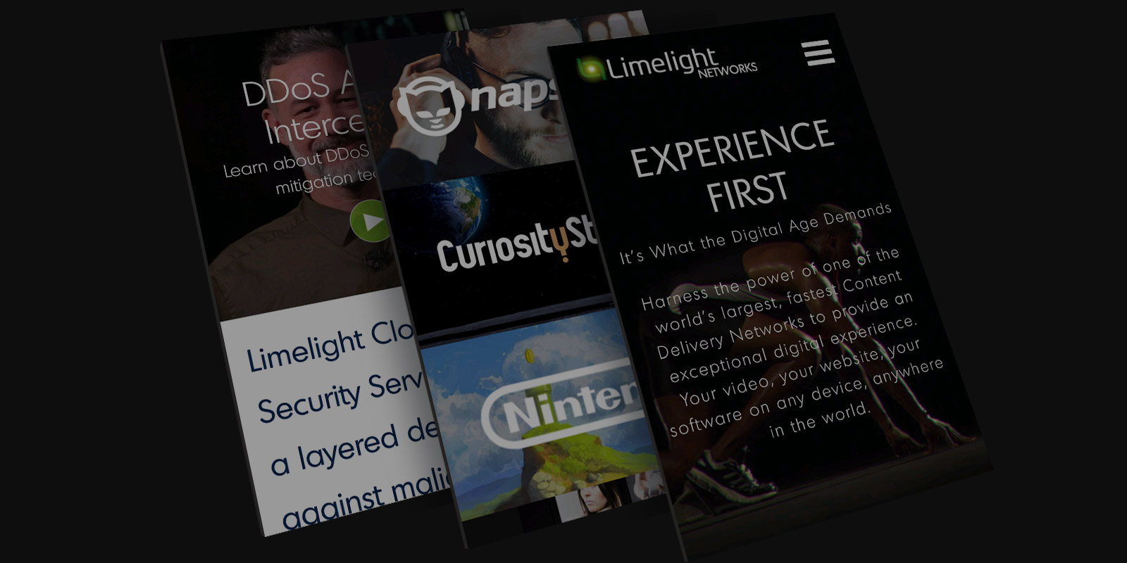
MOBILE DESIGN & CODE
- Desktop site was designed and coded with mobile in mind. Using boostrap for HTML Framework.
- The desktop design compacts gracefully into mobile.
- Media Query code created for high level of customization and fine tuning.
MOBILE UX
- Always present mobile navicon.
- Chat Now’ button always present.
- Full width easy to interact with button elements.
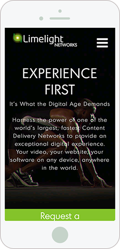
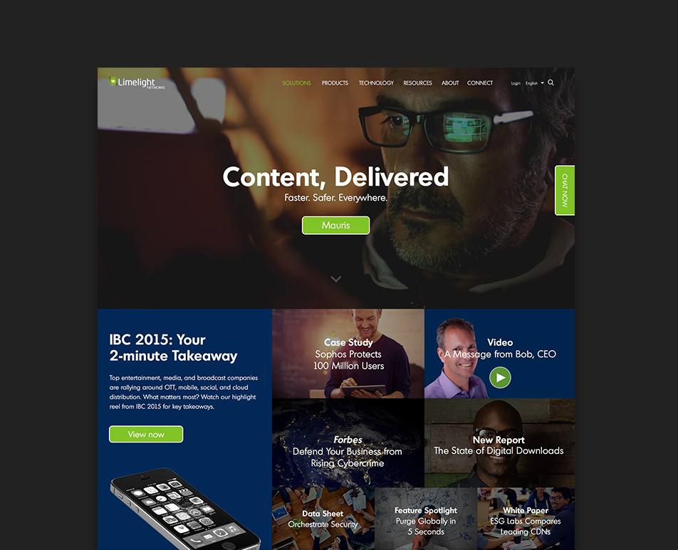
Homepage
Visit the limelight.com homepage page on your mobile device
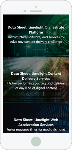
NEWS SECTION
News items collapse to one element across the browser width via bootstrap.
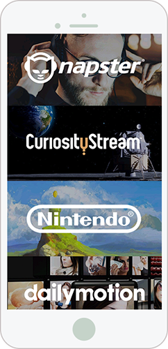
CASE STUDY SECTION
Logos that link directly to case studies. For some of our most high profile customers on the homepage.
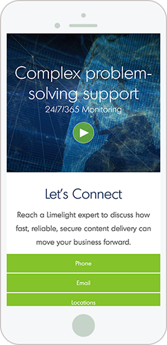
RESPONSIVE VIDEO
Video towards the bottom of the homepage, with contact links beneath.
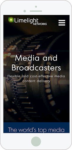
MEDIA AND BROADCASTERS page
The Media and broadcasters page is an example of a ‘solutions’ page on the limelight website. They all follow the same design template.
VIDEO DISABLED
Hero videos are disabled on mobile, replaced with a static image to improve performance.
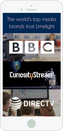
CASE STUDY SECTION
Logos that link directly to case studies at the top of the page. Specificly applicable to the Media and Broadcasters Industry. The highest value content is at the top of the page.
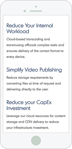
OPTIMIZED MOBILE COPY
Copy sized best for mobile easy of legibility, via media queries.
Visit the Media and Broadcasters page on your mobile device
More Projects
Get in touch
Drop me a line at ted@tedpotter.com I'd love to hear from you!