In fall 2015 our small creative team at limelight set out to completely redesign our corporate website. The team consisted of myself as designer, a developer, project manager, video editor/animator, and creative director. We completed the project in around 2.5-3 months from start to finish, drawing board to go live.
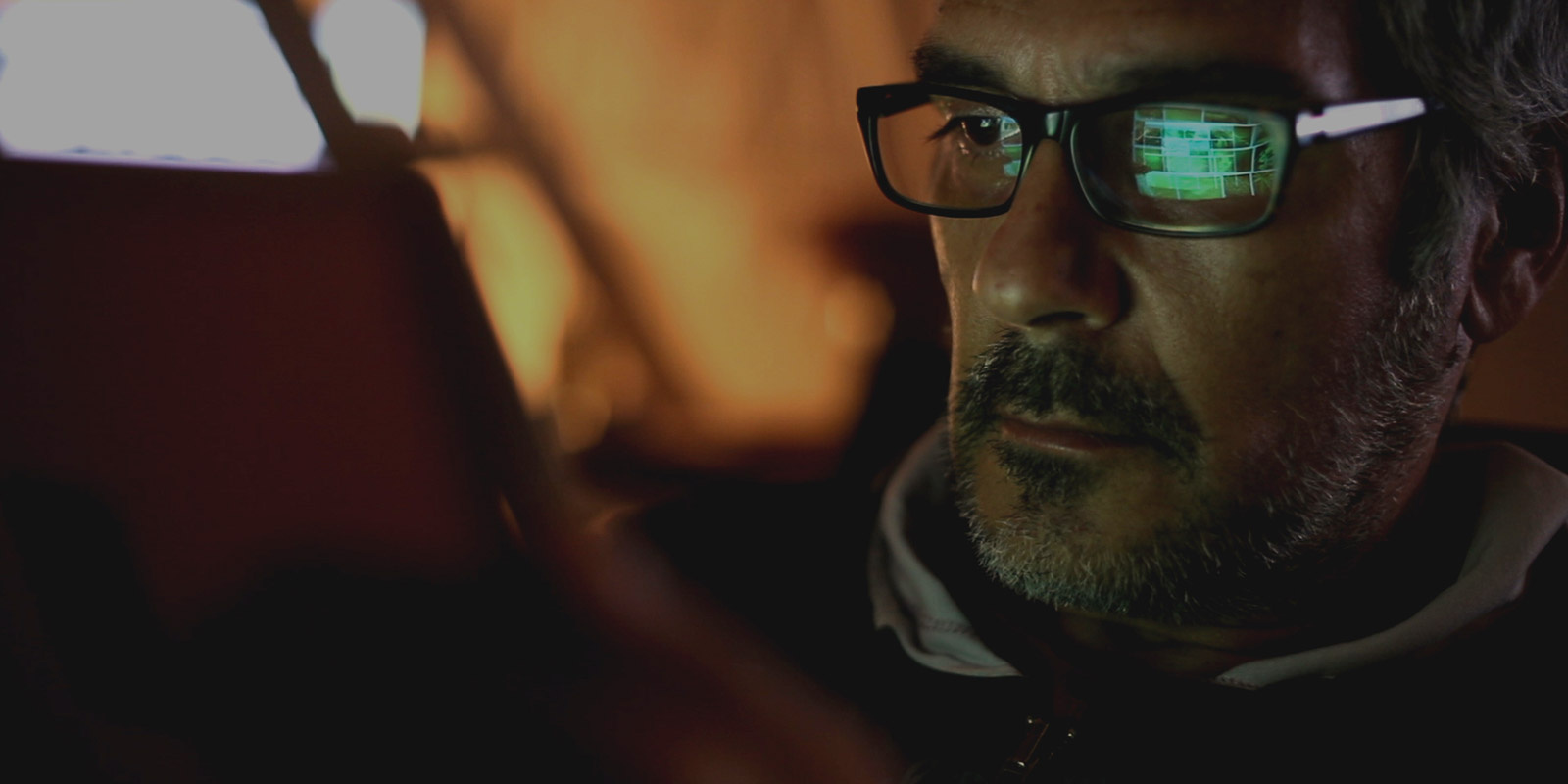
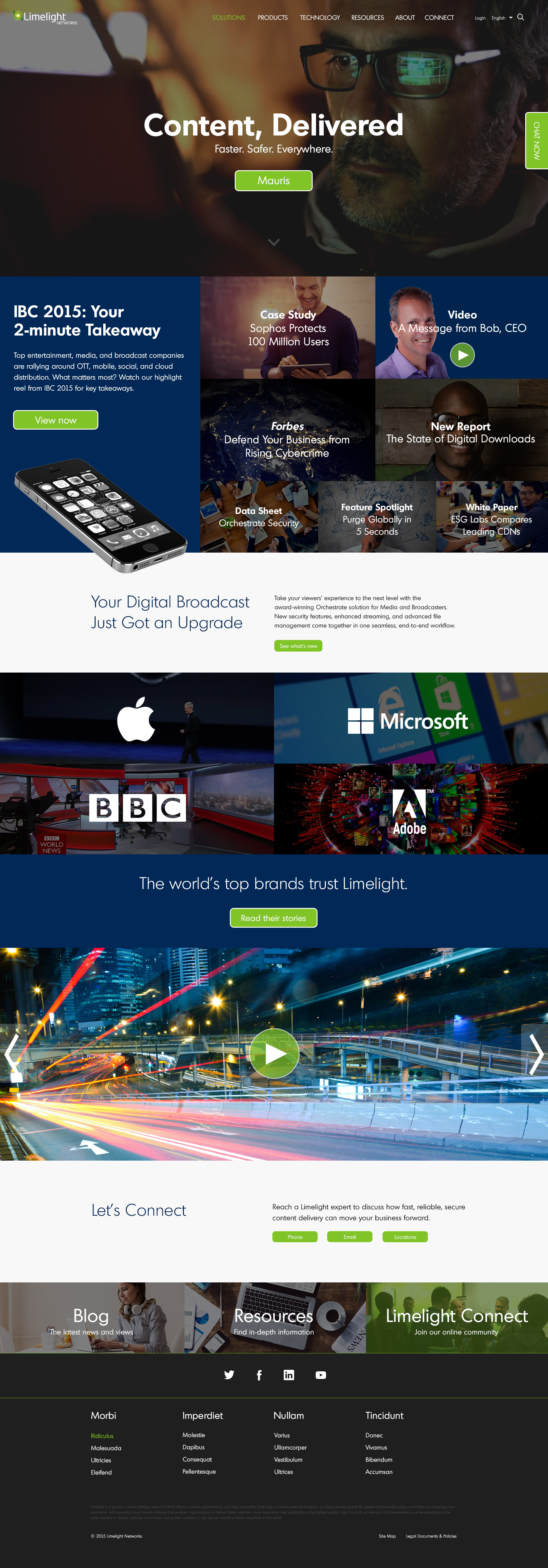
Prior to this redesign we had been maintaining and improving upon a legacy website that was in use when I started at limelight in February 2014. For the redesign we were looking for a modern, sleek, professional design. A design that included a lot of bold high quality imagery. As Limelight is a CDN (Content Delivery Network), the services Limelight offers are highly technical and abstract, we wanted to bring some humanity into the branding ethos, to visually represent the services limelight delivers. Which are in short, to deliver digital content across Limelight’s global private network.
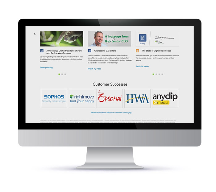
limelight.com is primarily a sales focused website. With various landing pages for limelight’s specific services and solutions. As well as a wealth of resource information on those services in standard marketing materials such as videos, data sheets, white papers, and more.
Key UX Decisions
- Fully responsive experience for mobile devices.
- Much greater focus on video. Video content used towards the top of the layout whenever available, used as a large design element.
- Consolidated IA, dramatically streamlined Sitemap.
- Always present chat option with much higher visibility in the design.
Key Design Choices
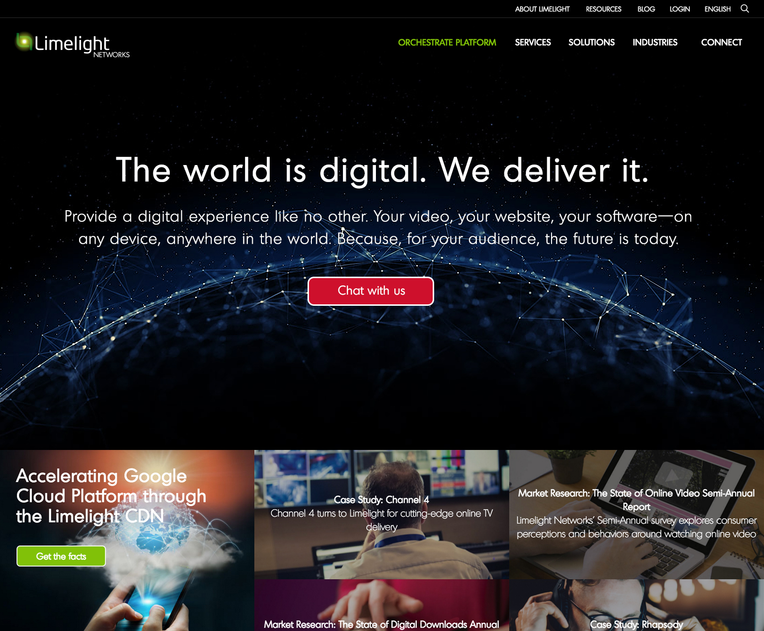
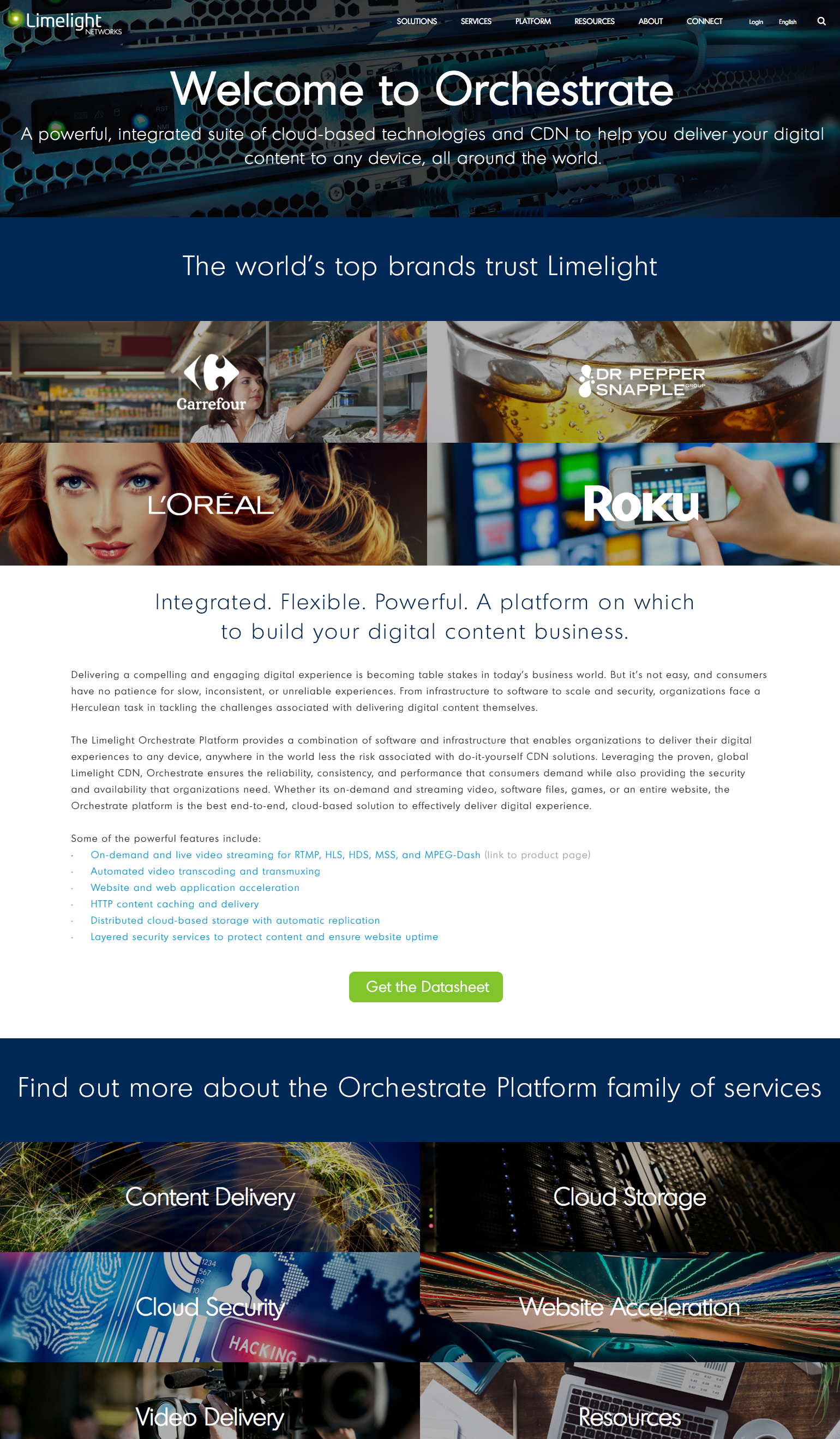
- Video hero spaces backgrounds. Bringing some life and motion into the design.
- Use of bold high quality stock imagery. Bringing a human element into the branding ethos of Limelight.
- Clean, professional, modern design direction.
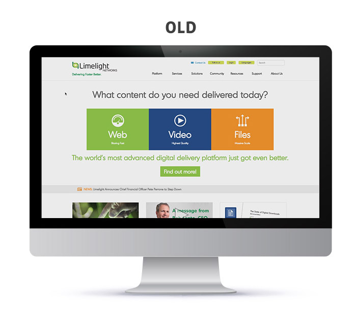
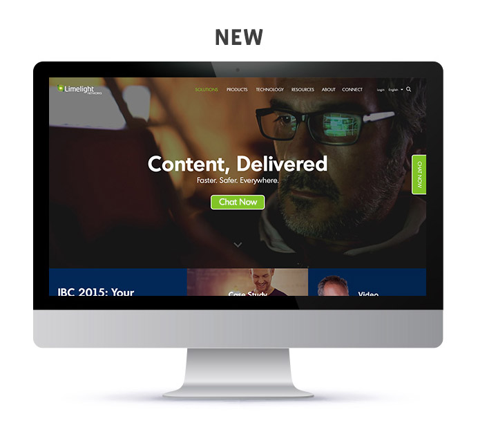
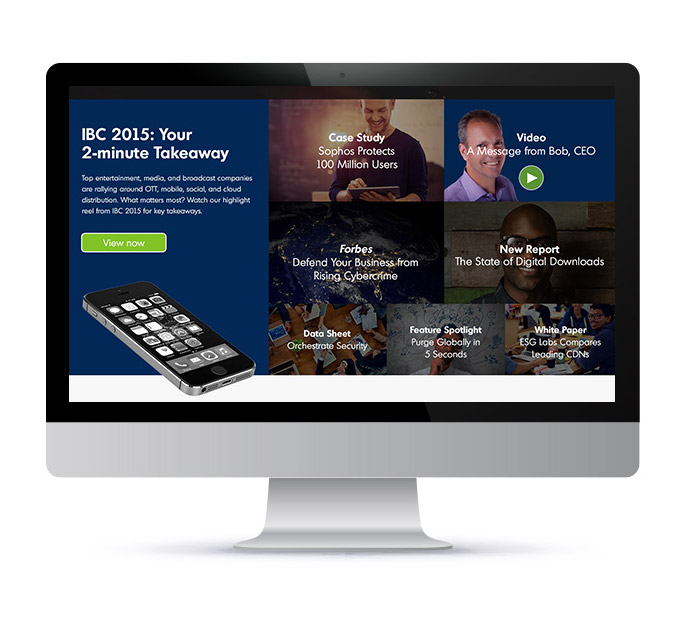
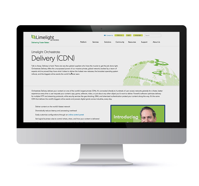
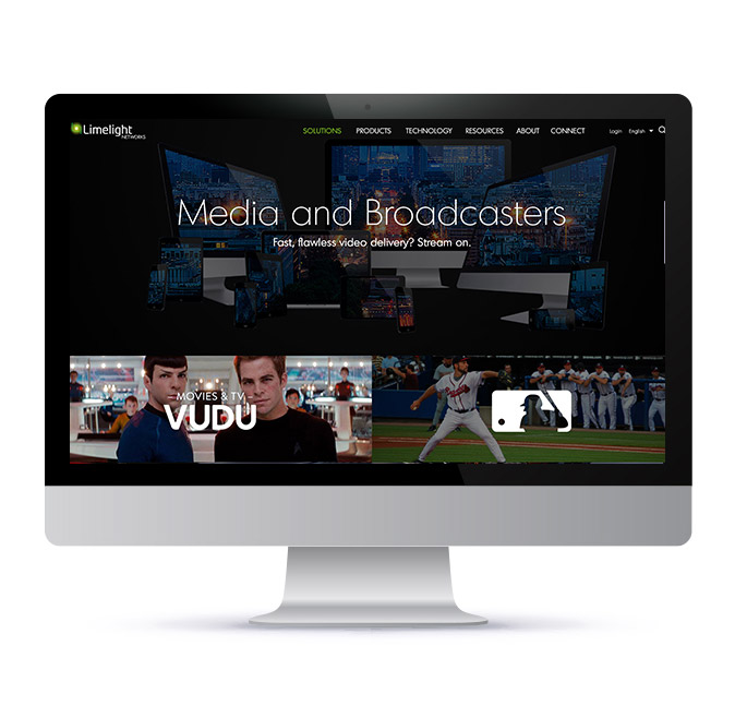
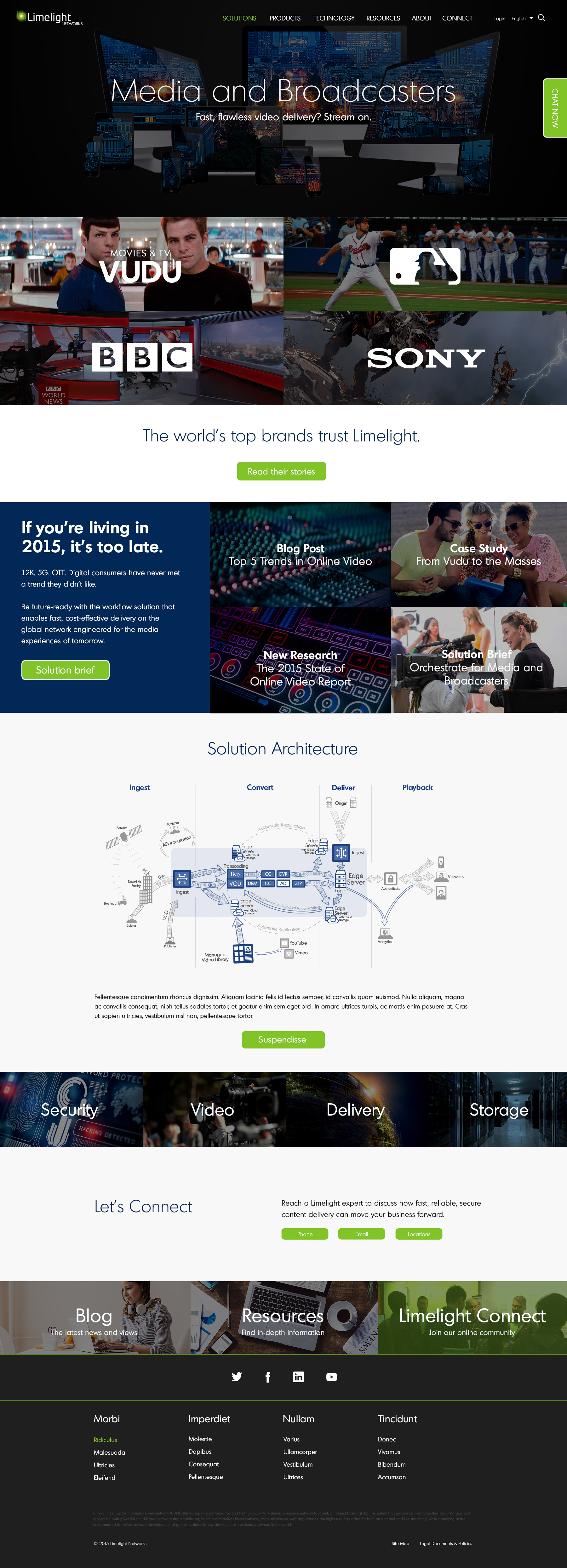
Solution page Redesign Comparison
Full Comp Images
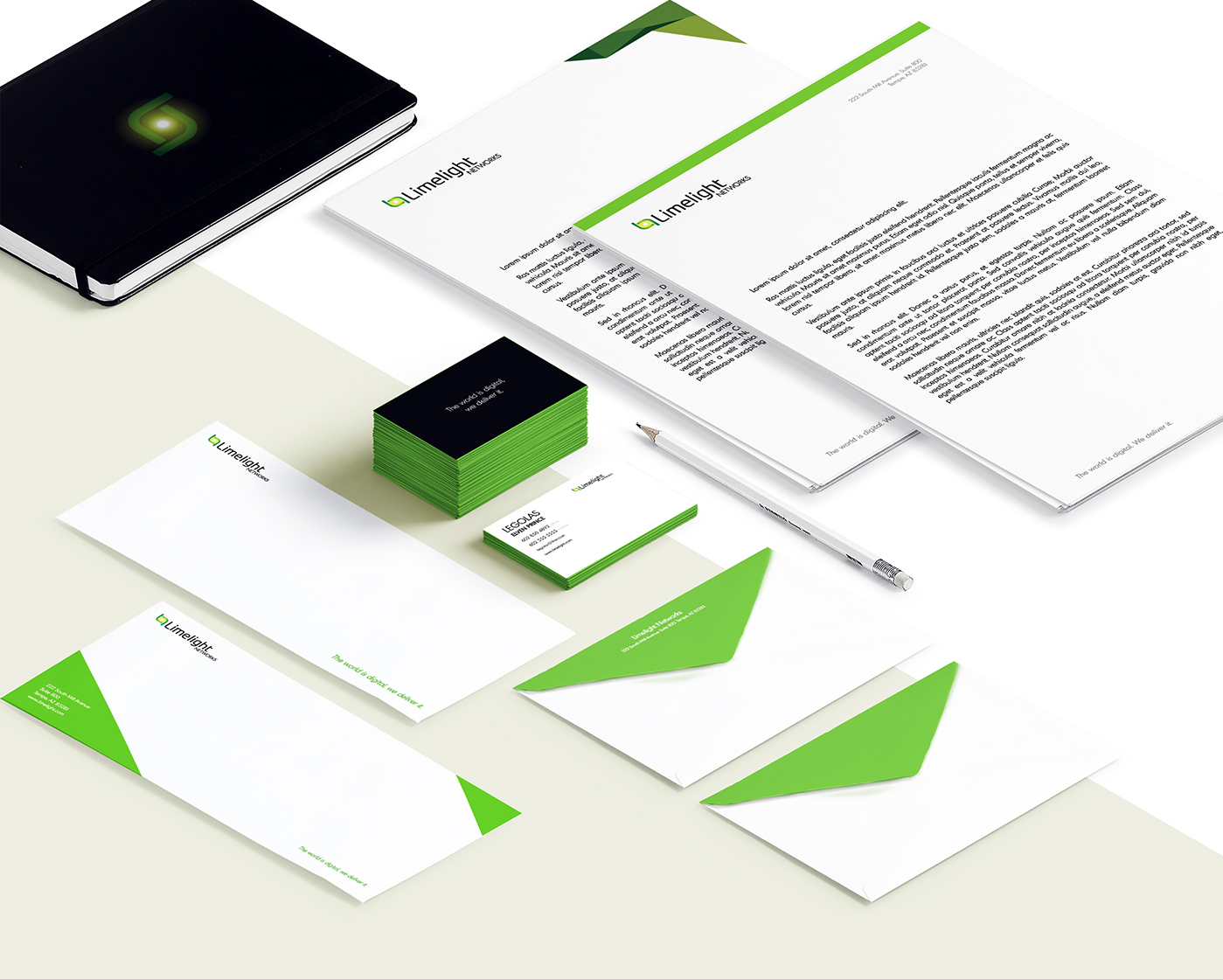
Stationery Redesign
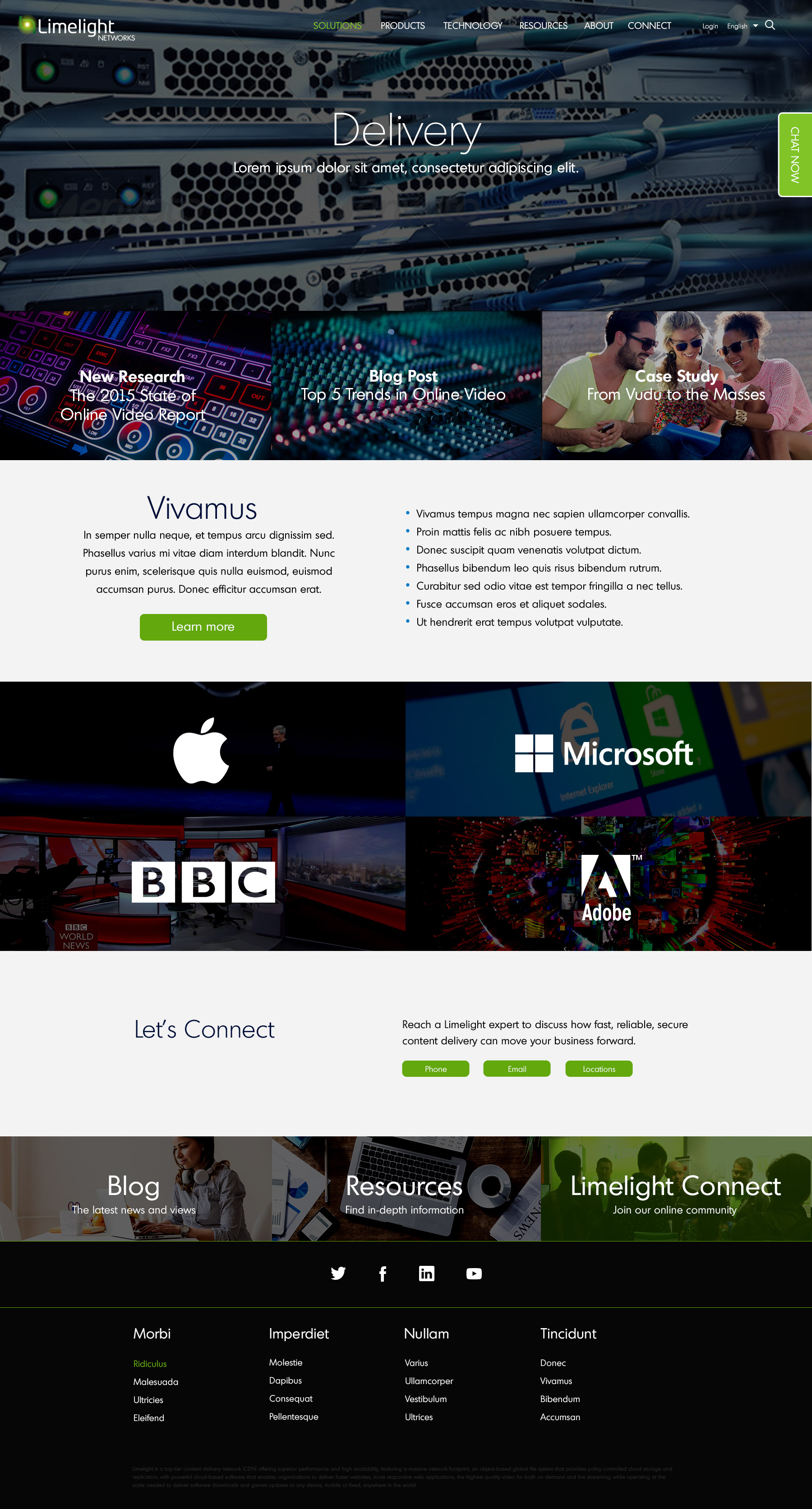
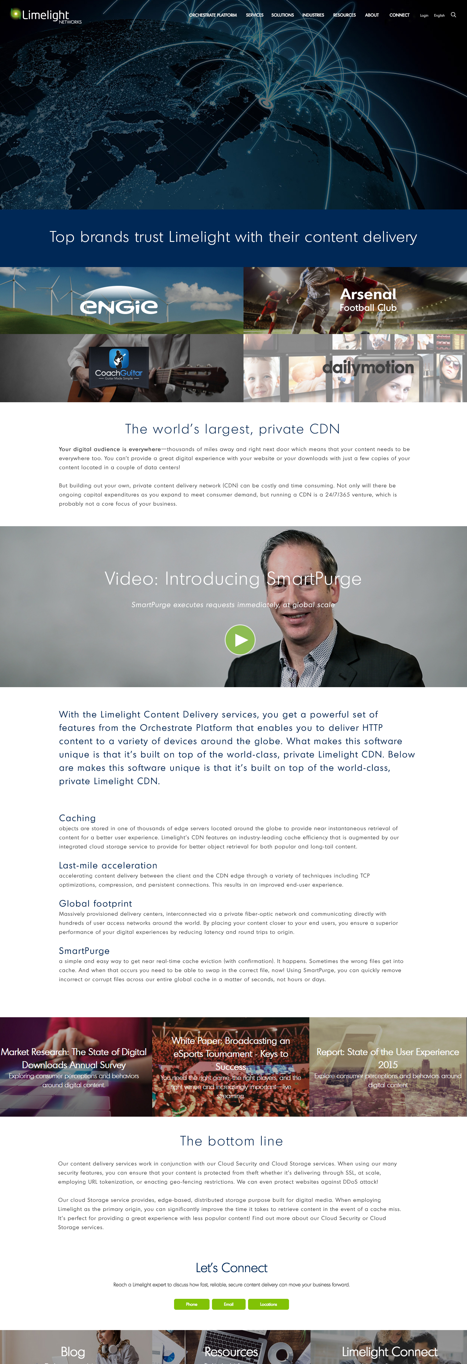
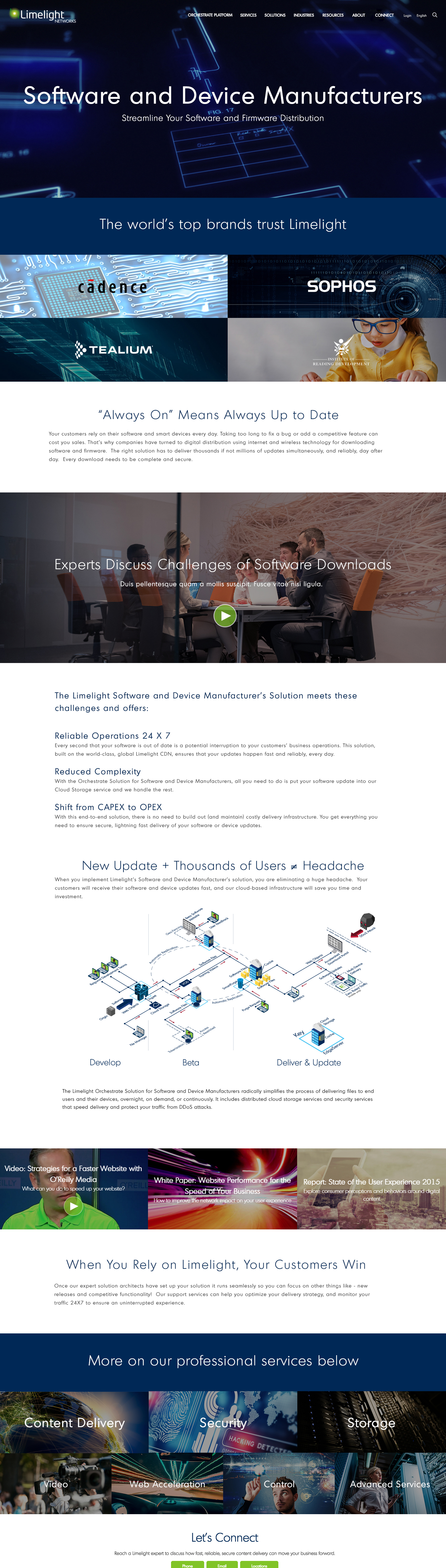
2016 Summer Refresh
In the summer of 2016 we set out to produce a major overhaul of the corporate website. Our legacy website prior to the redesign of Fall 2015 had a huge amount of content that was of low quality and with poorly organized information architecture. So in the redesign we significantly reduced the amount of content. But we realized the significant reduction of copy was an over-correction, and it was hurting our organic SEO.
So this refresh set out to correct that, each landing page received a significant increase in the amount of copy. We also re-organized the layout to make the case studies we had, accessible by the corresponding logo on each page.
Key UX Improvements
- Logos & their corresponding case studies put at the top of most landing pages, as our most valuable resource asset type.
- Significant increase in copy to better explain our services, and to improve our organic SEO.
- Mini Nav added above the main nav. This allowed us to consolidate the main nav, while adding more items to the navigation.
- “Industries” section added to the site. Using the same template as the solutions pages, but targeting specific industry needs for Limelight’s services.
More Projects

Get in touch
Drop me a line at ted@tedpotter.com I'd love to hear from you!